PETS DAY OUT
This project aimed to enhance the user experience on The Other Side Academy’s platform by redesigning the interface and implementing new features based on user feedback. The goal was to make navigation more intuitive, increase overall user engagement, get more donations and ultimately helping the program grow.
Area of Focus
Creative Direction + Product Design
Year
2024
Website
theothersideacademy.com
Tools used
Figma
Services
Branding Web design

Details
Lorem ipsum dolor sit amet
I craft striking and timeless designs that capture attention while remaining human and accessible. Every visual element is intentional, aligning aesthetics with purpose to create impactful experiences.
I craft striking and timeless designs that capture attention while remaining human and accessible. Every visual element is intentional, aligning aesthetics with purpose to create impactful experiences.
I craft striking and timeless designs that capture attention while remaining human and accessible. Every visual element is intentional, aligning aesthetics with purpose to create impactful experiences.
CHALLENGE
GOAL
Lorem ipsum dolor sit amet
RESULT
Lorem ipsum dolor sit amet
DESIGN THINKING

Target Audience:
John is a 25-45 year old that is looking to get his life on track again, Recently out of jail, he has very little education and is not tech savvy, but wants to change, and become a successful member of society.
Empathize
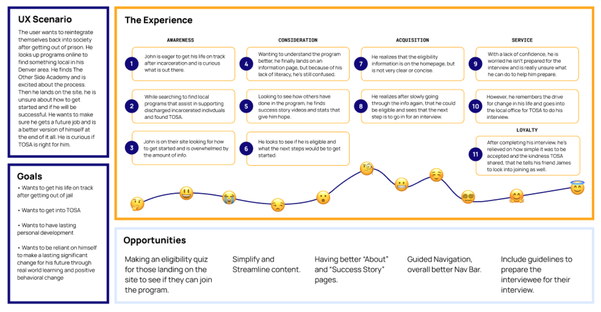
The Other Side Academy’s users, often facing challenges such as limited education, low literacy, and minimal tech skills, need clear and accessible information about TOSA’s life-changing impact, the level of commitment required, and the enrollment process. They seek self-reliance and require supportive reinforcement for personal growth to overcome their disadvantaged circumstances.
Following an extensive analysis involving persona development, user journey mapping, mind mapping, and collaborative diverge-converge exercises, our team has identified a pivotal opportunity to enhance the user experience. We aim to streamline by redesigning the homepage and ultimately adding a intuitive eligibility quiz that will determine whether a user needs to prepare for an interview or not.


Define + Ideate
Following an extensive analysis involving persona development, user journey mapping, mind mapping, and collaborative diverge-converge exercises, our team has identified a pivotal opportunity to enhance the user experience. We aim to streamline by redesigning the homepage and ultimately adding a intuitive eligibility quiz that will determine whether a user needs to prepare for an interview or not.


Current Design of Homepage and Application Process
Following an extensive analysis involving persona development, user journey mapping, mind mapping, and collaborative diverge-converge exercises, our team has identified a pivotal opportunity to enhance the user experience. We aim to streamline by redesigning the homepage and ultimately adding a intuitive eligibility quiz that will determine whether a user needs to prepare for an interview or not.


Low Fidelity Prototype
Link to Low Fidelity Mock Ups HereWe chose Poppins and Manrope for the two fonts for the TOSA redesign, which are supportive and confident yet structured fonts due to their clean, geometric designs and rounded edges. Poppins offers a friendly, approachable feel with a balanced structure, while Manrope combines modern minimalism with slight humanist features for warmth.
We also updated the current colors conveying a sense of trust and warmth while maintaining their current color scheme and leaving a clean and contemporary aesthetic, while still maintaining accessibility with color usage.


Branding
Following an extensive analysis involving persona development, user journey mapping, mind mapping, and collaborative diverge-converge exercises, our team has identified a pivotal opportunity to enhance the user experience. We aim to streamline by redesigning the homepage and ultimately adding a intuitive eligibility quiz that will determine whether a user needs to prepare for an interview or not.

Application of the Brand on High Fidelity Prototypes
Testing involved 4 users with varying familiarity with measuring task success, time on task, and user feedback. Observations and surveys will highlight pain points and improvement opportunities. The results will guide refinements to optimize user experience, increasing engagement and support for the organization’s mission.
We added an eligibility quiz to the TOSA website to streamline the user experience and provide immediate clarity for potential applicants.
The quiz helps users quickly determine if they meet the criteria for acceptance into the academy. If they don’t meet the criteria, we provide them with a link to the FAQ page providing information as to how they may be able to in the future.
This feature also empowers users to self-navigate the process with confidence, saving time for applicants, their families and TOSA.

Testing
Link to Low Fidelity Mock Ups HereTakeaways
After testing 4 users, we were able to validate our redesign of the TOSA website, demonstrating that improvements in color, visuals, spacing, content, and overall flow significantly enhanced the user experience. By applying key design principles—such as visual hierarchy, readability, the figure-ground principle, and intuitive navigation—we ensured the site was more engaging, accessible, and easy to use.
Key opportunities include making navigation more seamless and providing users with greater insight into TOSA's mission and impact, all while assisting those wanting to join the program to see the opportunities that lie ahead of them with success of the program. These enhancements will not only improve the user experience but also support the program’s growth.

APOSTROPHE

Next